GRAPHIC DESIGN & VISUAL BRANDING CASE STUDY
FEATURED WORK: The Lexicon
CLIENT OVERVIEW
The Lexicon aims to educate people on the terms of the conversation framing sustainability, from food & agriculture to water, energy and more. As a demonstrated leader in sustainability, The Lexicon advocates through social channels, interactive tools, films, and artworks from community conversations to the UN Food Summit. Their ever-growing list of activators — year-long workshops among domain experts to solve environmental issues — is especially notable.
DESIGN CHALLENGE
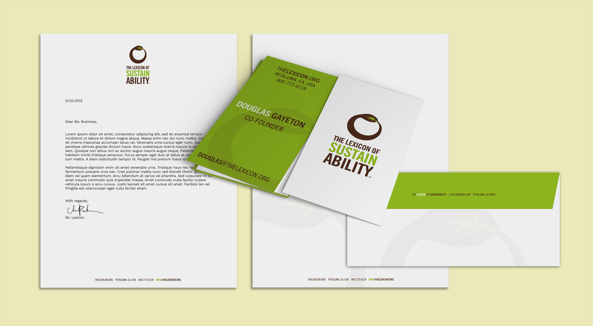
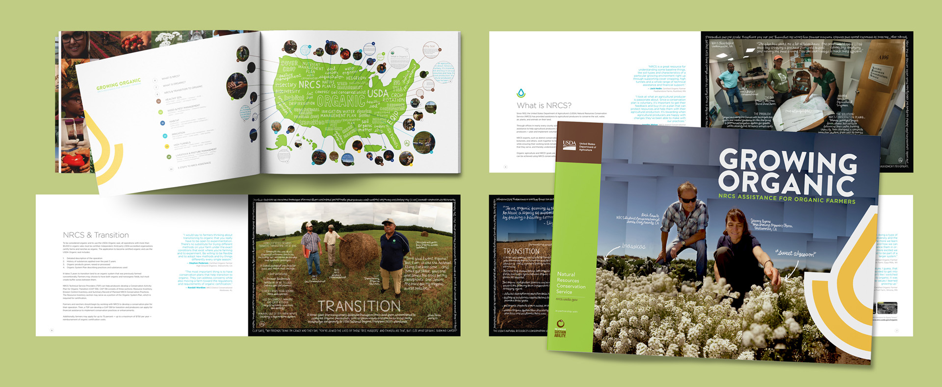
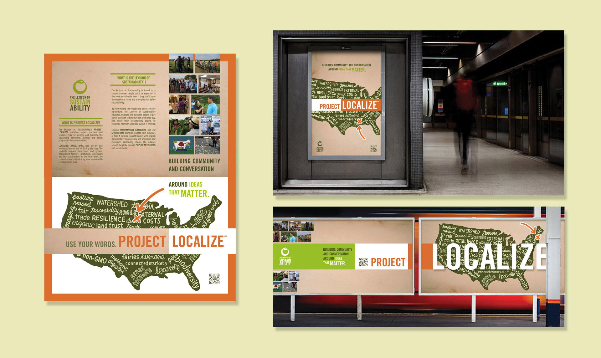
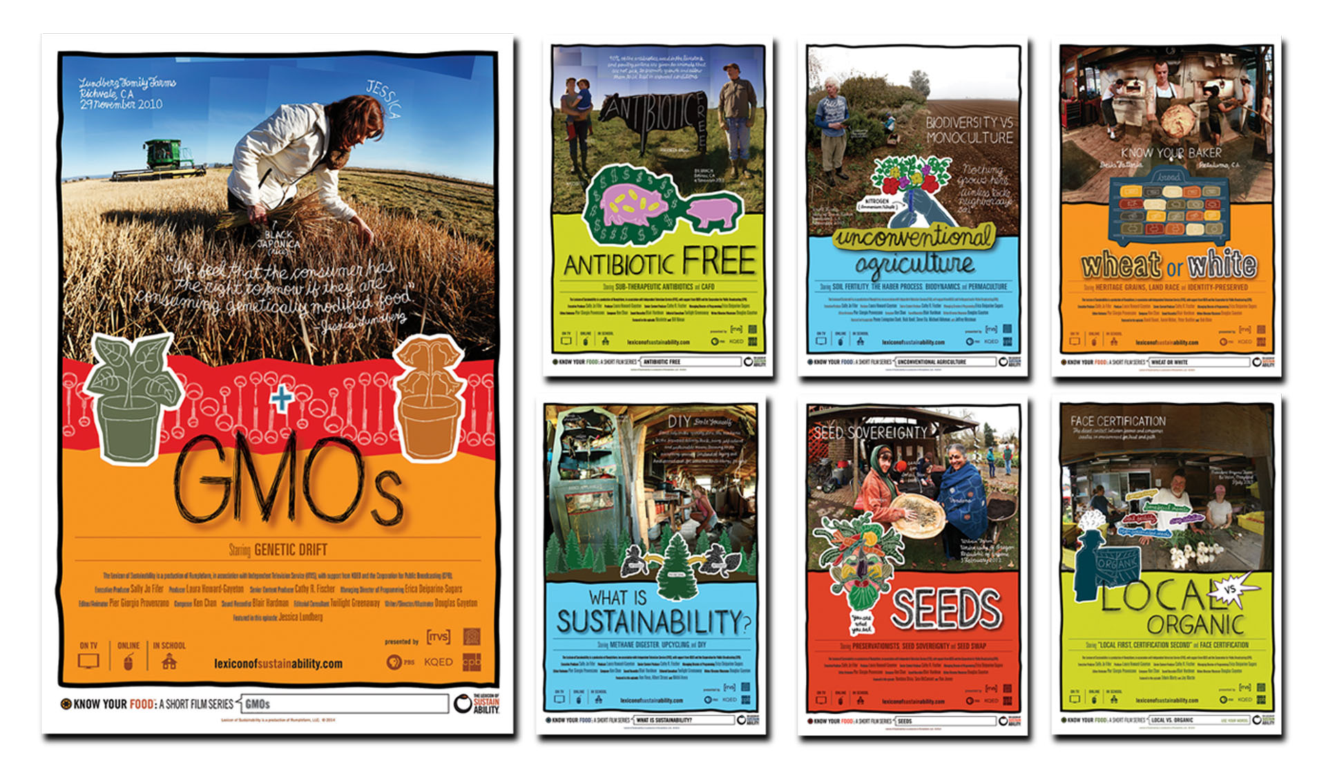
For this multifaceted client I’ve designed and consulted across the board — brand identity, project logos, print marketing campaigns, website design, book design, and more. Invited to participate in the Regen 1, a Lexicon- and Google-produced activator championing regenerative agriculture, I created the foundational design system and aesthetic for the Foodicon icon system.

“Anne has played a critical role at many stages in the development of our company. She is much more than simply an art director; she is a generous and resourceful creative partner whose rare gifts often transform our vaguely articulated concepts into clear, evocative, solid expressions that reflect our company’s greatest ideals. It should come as no surprise that her work often leaves us striving later to fulfill the promise her design approaches take in expressing the full breadth of our work.”
— DOUGLAS GAYETON, Co-Founder, The Lexicon
As a founding member and designer of The Lexicon & Google co-sponsored Regen1 Activator, I was tasked with designing a ‘visual language for place’ in the context of regenerative agriculture. Out of that came the genesis for the LexIcons, a globally-adaptable and open-sourced icon system describing the food system. With Adobe’s help we launched a collection of over 2,700 icons sourced from designers in over 30 countries. The collection can be found at thenounproject.com.

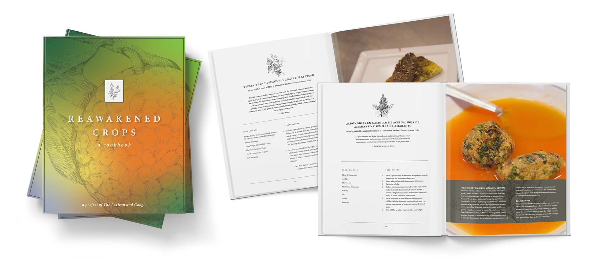
With dozens of activators under its belt, The Lexicon is poised to publish a suite of highly visual books telling the story of sustainability through information artworks and in-depth conversations with domain experts. The goal is to encourage producers and consumers to make better-informed choices to promote a healthier planet.


