DIGGES DESIGN | GRAPHIC DESIGN & VISUAL BRANDING
The Lexicon / CASE STUDY
The Lexicon
/ CASE STUDY
CLIENT OVERVIEW
The Lexicon educates people on the language framing the sustainability conversation, from food & agriculture to water, energy and more. As a demonstrated leader in sustainability, The Lexicon teaches and advocates through multi-media: films, information artworks, interactive tools, and social channels. Their reach spans community conversations, UN Food Summit keynotes, and everything in between. Their ever-growing list of activators — year-long workshops among domain experts to solve environmental issues — is especially notable.
Design Challenge
I’ve designed and consulted across the board for The Lexicon — brand identity, project logos, brand guides, print campaigns, presentations and infographics, website design, book design, and more. Invited to participate in Regen1, a Lexicon- and Google-supported activator championing regenerative agriculture, I created the foundational aesthetic for what would become Lex Icons, a visual language describing the global food system.
BRAND IDENTITY / INFOGRAPHICS / ICONS / PRINT / DIGITAL
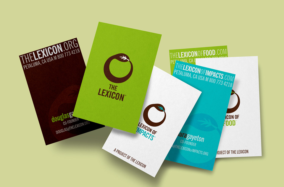
The Lexicon Identity
The Lexicon logo is based on the ouroboros symbol to convey the idea of sustainability and the perpetual circle of life. The color palette signals earth tones while showing up with strong energy and moments of pop. The logo needed to be digital-first while also having the capacity to grow with the brand as new properties emerge. Taking cues from the primary logo I’ve also designed a broader family of project logos and icons.


“Anne has played a critical role at many stages in the development of our company. She is much more than simply an art director; she is a generous and resourceful creative partner whose rare gifts often transform our vaguely articulated concepts into clear, evocative, solid expressions that reflect our company’s greatest ideals. It should come as no surprise that her work often leaves us striving later to fulfill the promise her design approaches take in expressing the full breadth of our work.”
— DOUGLAS GAYETON, Co-Founder, The Lexicon
Regen 1 Infographics, web, packaging, print, social
As a founding member and art director of the Regen1 Activator I designed a ‘visual language for place’ in the context of regenerative agriculture. This language needed to explain regenerative agriculture, be fully scalable, and globally adaptable — all while being engaging and friendly. The resulting set of icons depicts geographic features, farming practices, renewable energy sources, and more. Intended to roll out on food packaging and elsewhere in the marketplace, its goal is to educate consumers as to the provenance of their food and influence purchasing decisions.
Out of my work with Regen1 came the foundational aesthetic for Lex Icons, a globally-adaptable and open-sourced icon collection describing the food system. I initially participated as an icon designer and later as a judge. With Adobe’s help we launched a collection of over 3,000 icons sourced from designers in over 32 countries. The collection can be found at thenounproject.com.
As a founding member and art director of the Regen1 Activator I designed a ‘visual language for place’ in the context of regenerative agriculture. This language needed to explain regenerative agriculture, be fully scalable, and globally adaptable — all while being engaging and friendly. The resulting set of icons depicts geographic features, farming practices, renewable energy sources, and more. Out of my work with Regen1 came the foundational aesthetic for Lex Icons, a globally-adaptable and open-sourced icon collection describing the food system. The collection can be found at thenounproject.com.

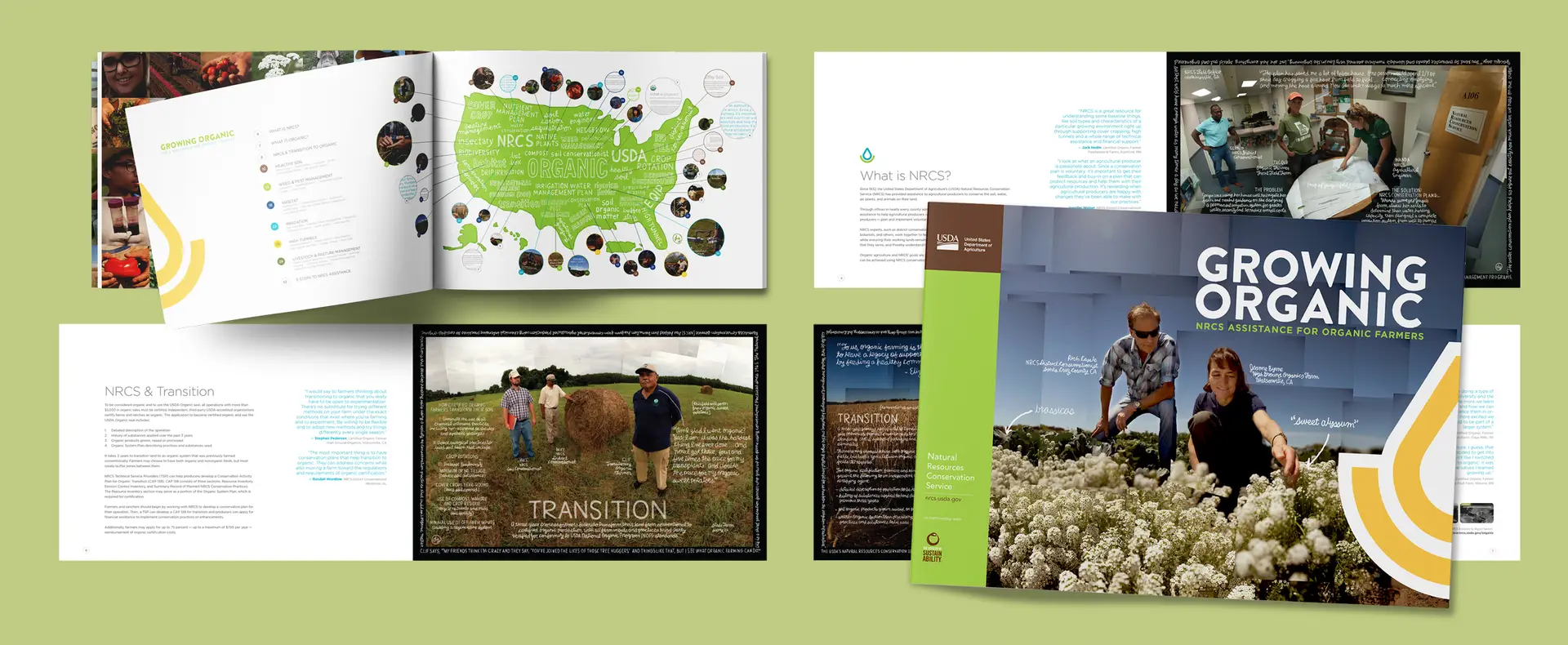
The Lexicon creates information artworks — powerful photographic images with written text overlays. They show up in print at pop-up art shows, in government agency agriculture field offices, on film screening posters, and more. I enjoy supporting this beautiful and informative body of work through print.


BOOK DESIGN
With over a dozen activators under its belt, The Lexicon is poised to publish a suite of highly visual books telling the story of sustainability through information artworks and in-depth conversations with domain experts. The goal is to encourage producers and consumers to make better-informed choices to promote a healthier planet. I designed these book layouts to pitch partnership with publishers.


